Obviously, elections in different states are not independent events. If a poll misses something or misjudges an area, it is likely to be similarly misjudging demographically similar areas. That’s why we introduced correlation into our model, as a way of adjusting for the relationships between the states
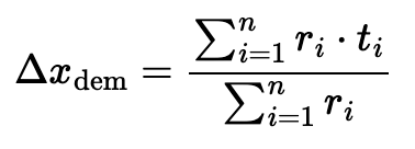
The method of correlating states that our model currently uses is based around demographic data. We found the demographic categories that most impacted the outcome of past elections, and then standardized the values for each state by converting them to z-scores. We then created a correlation matrix between each senate race and every other senate race based on the similarity of these z-scores. We calculated a simulated Democratic voter percentage for each race every time we ran our simulation, then noted the difference between our predicted percentage and the simulated one. We took the weighted average of their differences using the correlation coefficients for each race to find our shifts due to correlation.

This method ensured that the bigger the correlation was between the demographics of two states, the larger effect each race would have on the shift of the others. If one race was way off from its predicted lean in a simulation, then a race in a similar state would be similarly off.
While the problem of correlation is quite complex, this solution has some definite flaws. The basis for our correlation model is that demographic data may account for variation that the polls do not cover, with the assumption that if a certain demographic is undercovered by a poll in one state and leans a certain way, it will be similarly undercovered in another state and lean the same direction. However, we don’t know if this is true. In addition, the method of averaging all of the simulated leans together may lead merely to our predictions being pulled closer to each other for correlated states, rather than being pulled meaningfully more Democratic or Republican.
In order to test our correlation model, we applied our correlation system to poll data from 2018. We found poll data for each state from the 2018 Senate elections, then applied correlation based on demographics and compared it to each state’s real outcome. If the data was closer to the real outcomes of these elections with correlation appled, then our method of correlating states may be valid. If not, then we may need to rethink it.
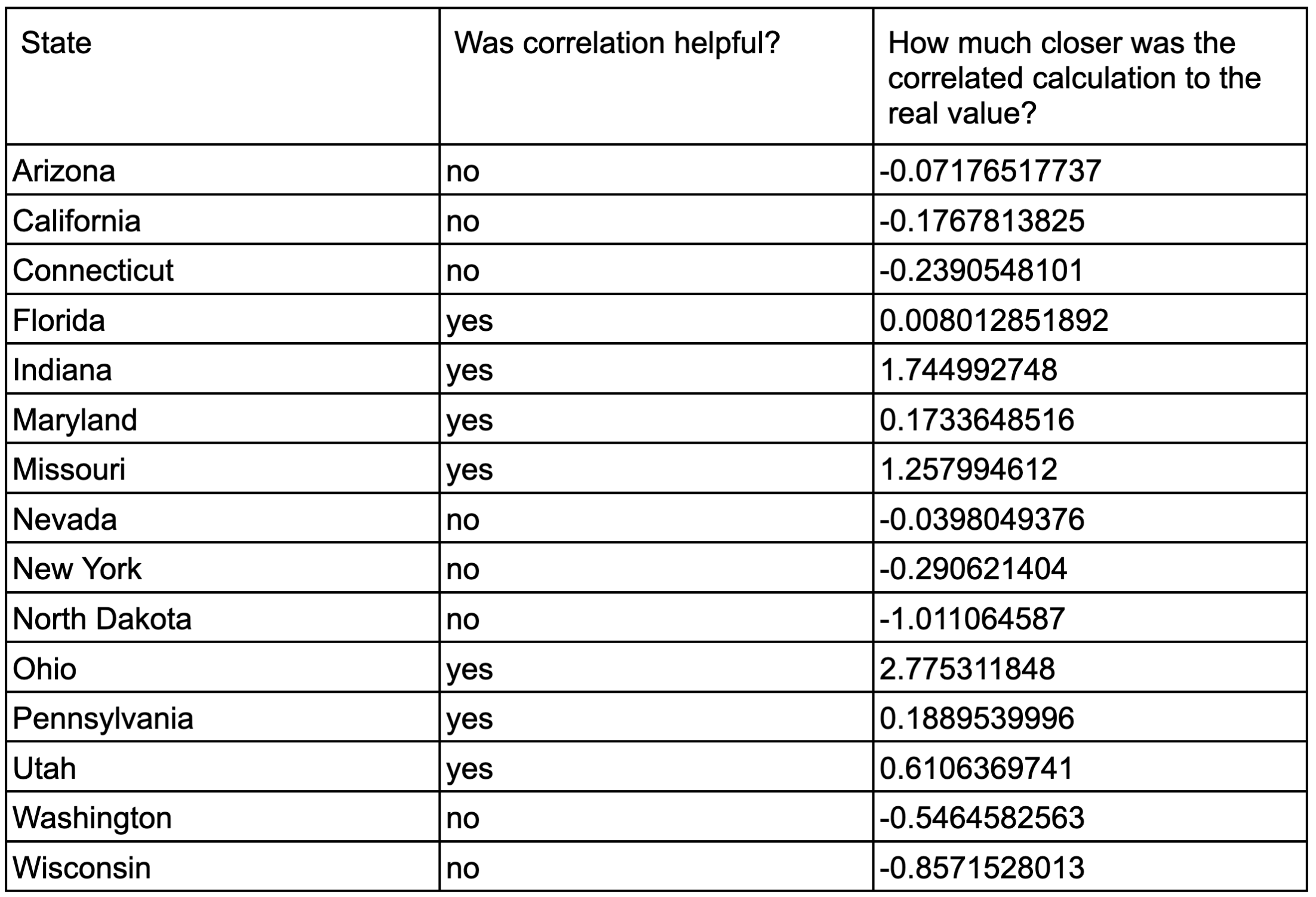
Here’s what we found:

Overall, applying correlation based on demographics seemed to do about as much harm as it did good. Out of the fifteen total states that had senate elections in both 2022 and 2018 (and therefore had adequate data for us to compare), seven predictions were improved by the addition of correlation data, and eight were hurt by it. We can conclude from this that our current method of determining correlation is not necessarily harmful, but is definitely not helpful either. While it doesn’t change the results drastically, it’s a waste of time and resources to calculate correlation if doing so is more often than not unhelpful. Based on what we found, we’d be just as good doing nothing (and we’d save a lot of time, too).


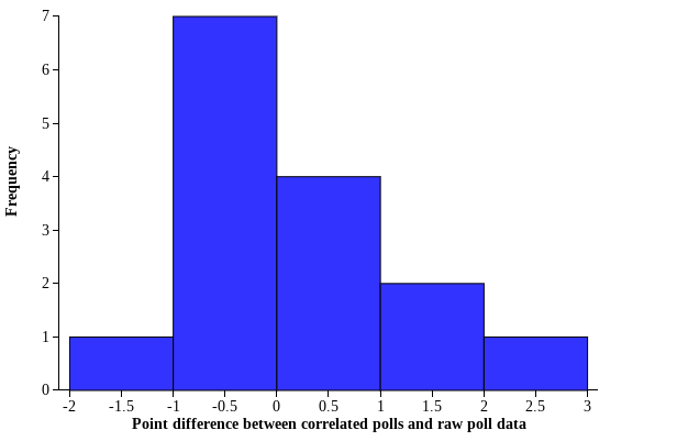
Plotting the difference in points between the correlated polls and the raw data polls (with negative values representing a worsened prediction and positive values representing an improved prediction), we can see that what difference correlation makes is varied in effectiveness. The data is right skewed with a man of 0.235 points of improvement, suggesting that our correlation formula did significantly improve predictions for several elections. The majority of our data, however, shows that correlation slightly hurt the election predictions, with the correlated data having a median value 0.04 points worse than the raw poll data.
We put a specific focus on the results of our test on five battleground states: Arizona, Wisconsin, Pennsylvania, Nevada, and Florida. We calculated how closely these states were correlated with one another, which we can use to draw conclusions about whether our correlation model might work better on states from certain regions or with certain demographic profiles. The split of improvement and harm among these states was quite similar to the split of the overall data, with Florida and Pennsylvania improved by adding correlation, and Nevada, Arizona, and Wisconsin hurt. Arizona, Nevada, and Florida are all highly correlated with one another based on demographic data – our test shows that while Nevada and Arizona were both hurt by our correlation calculations, Florida was improved. While Wisconsin and Florida are highly negatively correlated, they were both helped by the correlation calculations. This data suggests that our method of correlation is not more helpful for states with certain demographic profiles than for others, but we would need more comparisons to be sure about this conclusion.

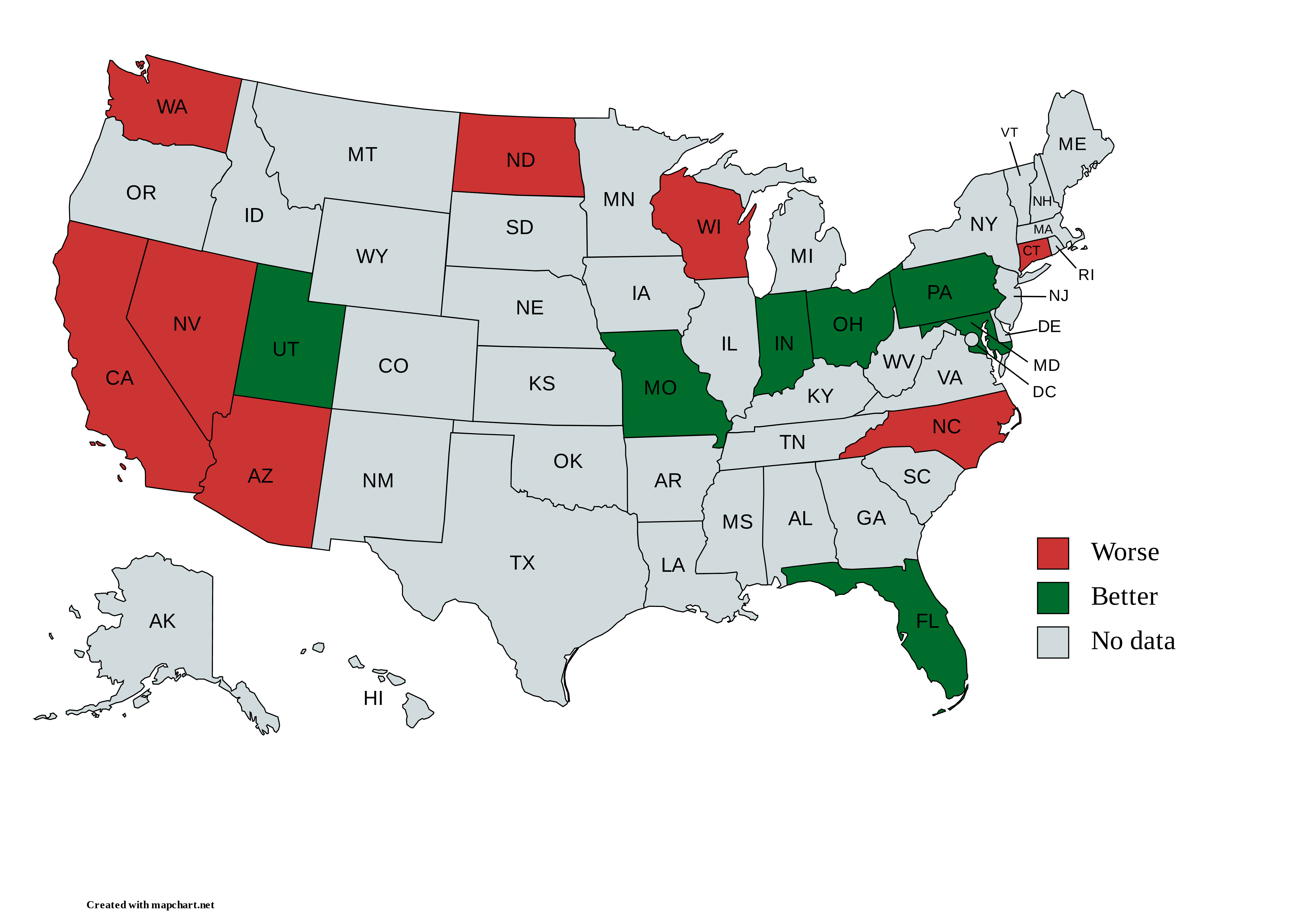
Placing our conclusions on a map, it seems like states that are physically close to one another may be more likely to be improved or hurt by our correlation calculation (such as in the Rust Belt and the Southwest), suggesting that physical location may play a more important role in determining correlation than we gave it credit for, seeing as longitude and latitude were not factored into our demographic profiles. Again, however, we were only able to draw any kind of conclusion for fifteen states – having more data may help us be more sure about our conclusions.
One explanation for why there was basically a 50/50 split on whether the correlation was helpful is because every Δx_dem that we calculated was negative, meaning it pulled the average polls in favor of the Republicans. If we imagine that the polls are roughly 50/50 whether they are overestimating the Democrats or overestimating the Republicans compared to the actual election results, then it makes sense that if Δx_dem only pulls the total prediction towards the Republicans, it is accurate about half of the time. This suggests that there is a fundamental issue with the way the correlation coefficients are calculated which causes it to conclude that all states regardless of demographic profile will vote more Republican than expected.
In conclusion, correlation by population demographics is… not helpful. Applying correlation actually produces slightly worse results than if we were to do nothing at all, which is not a desirable trait for a deliberate aspect of the model. In future years, we may either need to reexamine our methodology, or to rework it entirely. Looking at previous years’ data, it seemed more and more obvious that the way to predict how correlated states would be was to look at how correlated they’ve historically been. If two states’ polls were wrong in the same way previous elections, then we can predict that they might be wrong in the same direction again. And if we want to find poll data from previous elections, it’s all on fivethirtyeight, waiting to be discovered. Trust us, we know.